
Customize the widget's theme
You can customize how the MoonPay widget looks to match the branding of your website and provide a more native user experience. We call those customizations a theme.
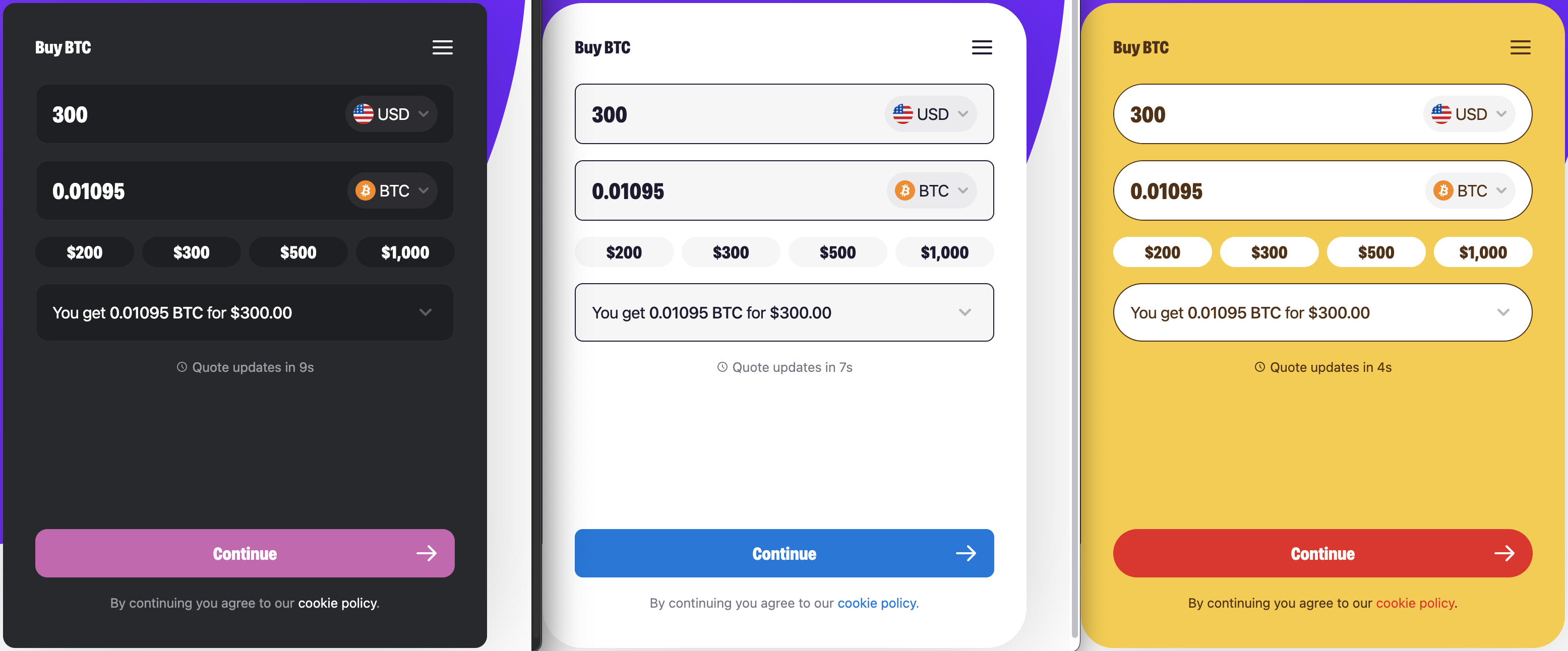
What can be customized?
Theme elements that can currently be customized include:
- Logo in header
- Colors, including support for light and dark mode
- Corner radius buttons
- Corner radius of foreground elements
- Icons
- Platters
- Input fields
Theme elements that will be customizable soon include:
- Size configurations
- Default
- Compact
- Pinned left or right full height
How can I create my theme?
Themes are created specifically for your website or application and will have an associated themeId that you include when initializing the Web SDK.
We are currently developing a self-serviced "build your own theme" feature. In the meantime, we'll create the theme for you, you just have to contact your Partner Success Manager.
How can I use a theme?
Once you have a themeId, you can include it in the parameters property of your SDK configuration. When the SDK is initialized with a valid themeId, the widget will load with the custom theme created for your application.
Updated 7 months ago